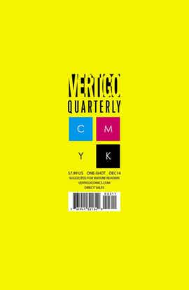
“Vertigo Quarterly: Yellow” #1 is the third installment of Vertigo’s CMYK anthology. The nine stories are variously set in outer space, different countries or imaginary lands, tied together only by the color yellow. The majority of the creative teams are able to tell a story with substance and shape in the space of a very small page count.
“The Vision of Sita” by Steve Orlando and Emilio Utrera is a monologue and flashback told by Raz, a former artist and now an immortal witness to the death of worlds. Raz’s turn of fate from success to failure is a vivid surprise, but the narrator becomes unlikable at the end as he reflects on fate. The story doesn’t quite measure up to its own ambition since Raz’s gravitas and martyrdom are not convincing.
“Untitled” by Gerard Way and Philip Bond is an excellent story, more for what it wisely leaves out than what is explicitly says. It opens smoothly and dives straight into some wild action, grounded by the reactions and reassuring ordinariness of the main character. Way does much for the story just leaving the reader to infer from context. With just the words “prince” and “sleepwalking again,” he suggests enough to give the story a rich background. The part that needs some explanation is why the driver’s vehicle was needed at all, but a perfect ending makes up for that. There’s an apt metaphor in how the driver making lemonade from a lemon, and the conversation feels magical for its combination of homecoming, tenderness, love and good karma. Way leaves the illness vague, but he hints that the cure is in hand, while leaving the facts open-ended.
“End of the Line” by Toril Orlesky is a story told in a subway line, with heavy emphasis on the double meaning of the title. The action becomes surreal and visually wonderful, going from bleakness to bright light. Orlesky’s imagery is what makes the story memorable.
“Playthings” by Marguerite Bennett and Bill Sienkiewicz” is a story about the dark side of a young girl named India. Bennett’s prose is poetic and fairy-tale-like and Sienkiewicz’s art is gorgeous and more than equal to the task of conveying the horror and mesmerizing suspense of violence and secrets. At the end, Bennett makes a leap with an analogy about God, the Devil and children. The last line falls flat because it too explicitly leads the reader by the nose to a moral than is more simplistic and less poignant Sienkiewicz’s imagery of India’s self-made hell.
“The Signal” by Diego Agrimbau and Lucas Varela is an extended metaphor about the yellow signal in traffic. An entire story about being stuck in limbo is theoretically interesting, but this doesn’t go beyond theory. The story fails since it stays within the box is made for itself, going nowhere.
“The Black Clade: by João M. P. Lemos is a fantasy story set in a quasi-medieval setting. Both Lemos’ diction and exposition are dense, but the use of the yellow as a symbol is excellent. Lemos uses color to demonstrate how bigotry and violence saps the color out of life and victory is hollow when built on blood.
“Amber” by Matt Miner and Taylan Kurtulus has beautiful art, using yellow for sunshine against light gray shadows and Kurtulus’ boxy linework. The last line of dialogue is appropriate but also creepy. On the whole, the twist ending is too abrupt and jarring for the story to carry deeper meaning.
“The Cataphract of the Yellow Lotus” by Benjamin Read and Christian Wildgoose has a twist that is far better-executed. The story begins with a village woman gathering yellow lotus blossoms who encounters a travelling court-in-mourning. The outcome is has emotional force but also some humor. Wildgoose’s art is especially beautiful for the opening and ending panels, too, giving the story an optimistic mood.
“The Magic Bag” by Fabio Moon is a trip down memory lane for a man who is moving out of his studio. It’s a short vignette, with less depth than the other stories in the anthology. However, Moon draws a great elephant and his technique with color is very pretty. With the mention of the vase, Moon ties it to together with the yellow bag and neatly reinforces the message of how material objects are triggers and containers for memories.
As a unifying note, Vertigo’s CMYK gimmick has been the most successful with the color yellow. This probably has something to do with how yellow has both a much longer history and a much heavier amount of cultural significance than either of its color printing siblings Cyan or Magenta. The nine stories clustered naturally, without editorial edict about the meaning of a hue. Inevitably, sunlight and lemons were recurrent visual leitmotifs, and well as the transition from summer to autumn. The writers seem to have made associations with the meaning of yellow as well, since most of the stories have dual themes of life/death, fertility/sterility and beginnings/endings. Despite this clustering, the stories defy other categorization and most succeed on their own terms. Collectively, the art is even more confident and distinctive than the writing. “Vertigo Quarterly: Yellow” #1 has a higher rates of hits than most anthologies as well as broad range and depth.

